Lunch Time Python
Lunch 7: matplotlib
matplotlib is a plotting library for Python and the NumPy library. It is easy to use and can be used to generate scatter or bar plots, density maps and even 3D plots in publication quality.
Press Spacebar to go to the next slide (or ? to see all navigation shortcuts)
Lunch Time Python, Scientific Software Center, Heidelberg University
Advantages of matplotlib:
- matplotlib is mostly used in conjunction with pyplot - a matplotlib module - that provides an easy-to-use interface
- Very versatile, works with many types of data
- Directly plot NumPy functions and arrays
- Many export options
- Customizable
- Can be used with additional toolkits that extend the functionality, like seaborn
matplotlib installation
Available via pip:
python -m pip install -U matplotlib
Or install via conda:
conda install matplotlib
Basic plots
Plot the sin and cos over a range of angles. For this, we also need numpy.
import numpy as np
import matplotlib.pyplot as plt
xvals = np.arange(0, 2 * np.pi, 0.1)
plt.plot(xvals, np.sin(xvals))
plt.plot(xvals, np.cos(xvals))
[<matplotlib.lines.Line2D at 0x7fd685e3ba10>]

The default settions already look quite nice!
Running inside a script
Or more generally, if you want to suppress the output (return) of the plt() function.
plt.plot(xvals, np.sin(xvals))
plt.plot(xvals, np.cos(xvals))
plt.show()
plt.show() closes the plot; if you plot using a script and not a notebook, place one plt.show() command at the end of your script.
Running inside a notebook: static images
You can plot static images inside your notebook using the %matplotlib inline magic: You only need to run this once. It is not always necessary to put this, but it makes it clear which Matplotlib backend should be used.
%matplotlib inline
plt.plot(xvals, np.sin(xvals))
plt.plot(xvals, np.cos(xvals))
plt.show()
Scatter plot
xvals = np.random.randint(10, size=10)
yvals = np.random.randint(10, size=10)
plt.scatter(xvals, yvals)
plt.show()

Bar plot
xvals = np.linspace(1, 10, 10)
yvals = np.random.randint(10, size=10)
plt.bar(xvals, yvals)
plt.show()

Customizing plots
plt.bar(xvals, yvals, label="Random series")
plt.legend()
plt.show()

Customizing plots
plt.bar(xvals, yvals, label="Random series")
plt.legend(fontsize=16, loc="upper right")
plt.xlabel("Integer", fontsize=18)
plt.ylabel("Magnitude", fontsize=22, color="red")
plt.title("My custom plot", fontsize=22)
plt.show()

Customizing plots
xvals = np.arange(0, 2 * np.pi, 0.1)
plt.plot(xvals, np.sin(xvals), marker="x", markevery=10, color="blue")
plt.plot(xvals, np.cos(xvals), marker="<", color="black", alpha=0.5)
plt.show()

Figure class: Advanced plots with the artist layer
A Figure in matplotlib is the whole plot (or window in the user interface) and can contain multiple plots. By accessing the Artist layer ("object-based plotting"), you can access more customizing options than with the basic plt.xxx Scripting layer ("procedural plotting") (see https://matplotlib.org/1.5.1/faq/usage_faq.html#parts-of-a-figure).
This also allows you to include multiple plots in one Figure.
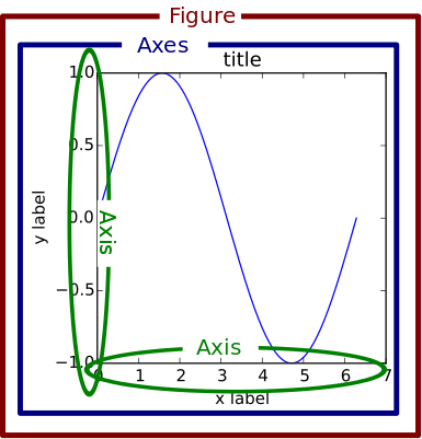
fig = plt.figure(figsize=(12, 10))  # width = 12 inches and height = 10 inches
# create one axes object
ax1 = fig.add_subplot(211)  # (2, 1, 1) no of rows, no of columns, no of plots
ax1.plot(xvals, np.sin(xvals), marker="x", color="blue")
plt.show()

It is also possible to use add_axes() instead of add_subplot(), but not recommended as with the latter, matplotlib takes care of the exact position of the axes in the figure.
Several subplots
Using add_subplot(), we can add one axes object at a time:
fig = plt.figure(figsize=(12, 10))
ax1 = fig.add_subplot(221)
ax1.plot(xvals, np.sin(xvals), marker="x", color="blue")
ax2 = fig.add_subplot(222)
ax2.plot(xvals, np.cos(xvals), marker="x", color="blue")
ax3 = fig.add_subplot(223)
ax3.plot(xvals, np.tan(xvals), marker="x", color="blue")
ax4 = fig.add_subplot(224)
ax4.plot(xvals, np.tanh(xvals), marker="x", color="blue")
plt.show()

A more practical way to add multiple subplots
fig, ax = plt.subplots(figsize=(12, 10), nrows=2, ncols=2)
ax[0, 0].plot(xvals, np.sin(xvals), marker="x", color="blue")
ax[0, 1].plot(xvals, np.cos(xvals), marker="x", color="blue")
ax[1, 0].plot(xvals, np.tan(xvals), marker="x", color="blue")
ax[1, 1].plot(xvals, np.tanh(xvals), marker="x", color="blue")
plt.savefig("my_figure.pdf", bbox_inches="tight")
plt.savefig("my_figure.jpg", dpi=300, bbox_inches="tight")
plt.show()
2D plots
def myfunc(x, y):
    return np.sin(np.sqrt(5) + x) * y


mf = 16
# the x and y values need to be spanned on a 2D mesh
num1 = np.arange(-5, 5, 0.1)
num2 = np.arange(-5, 5, 0.1)
X, Y = np.meshgrid(num1, num2)
print(X[0])
print(Y[0])
[-5.00000000e+00 -4.90000000e+00 -4.80000000e+00 -4.70000000e+00
 -4.60000000e+00 -4.50000000e+00 -4.40000000e+00 -4.30000000e+00
 -4.20000000e+00 -4.10000000e+00 -4.00000000e+00 -3.90000000e+00
 -3.80000000e+00 -3.70000000e+00 -3.60000000e+00 -3.50000000e+00
 -3.40000000e+00 -3.30000000e+00 -3.20000000e+00 -3.10000000e+00
 -3.00000000e+00 -2.90000000e+00 -2.80000000e+00 -2.70000000e+00
 -2.60000000e+00 -2.50000000e+00 -2.40000000e+00 -2.30000000e+00
 -2.20000000e+00 -2.10000000e+00 -2.00000000e+00 -1.90000000e+00
 -1.80000000e+00 -1.70000000e+00 -1.60000000e+00 -1.50000000e+00
 -1.40000000e+00 -1.30000000e+00 -1.20000000e+00 -1.10000000e+00
 -1.00000000e+00 -9.00000000e-01 -8.00000000e-01 -7.00000000e-01
 -6.00000000e-01 -5.00000000e-01 -4.00000000e-01 -3.00000000e-01
 -2.00000000e-01 -1.00000000e-01 -1.77635684e-14  1.00000000e-01
  2.00000000e-01  3.00000000e-01  4.00000000e-01  5.00000000e-01
  6.00000000e-01  7.00000000e-01  8.00000000e-01  9.00000000e-01
  1.00000000e+00  1.10000000e+00  1.20000000e+00  1.30000000e+00
  1.40000000e+00  1.50000000e+00  1.60000000e+00  1.70000000e+00
  1.80000000e+00  1.90000000e+00  2.00000000e+00  2.10000000e+00
  2.20000000e+00  2.30000000e+00  2.40000000e+00  2.50000000e+00
  2.60000000e+00  2.70000000e+00  2.80000000e+00  2.90000000e+00
  3.00000000e+00  3.10000000e+00  3.20000000e+00  3.30000000e+00
  3.40000000e+00  3.50000000e+00  3.60000000e+00  3.70000000e+00
  3.80000000e+00  3.90000000e+00  4.00000000e+00  4.10000000e+00
  4.20000000e+00  4.30000000e+00  4.40000000e+00  4.50000000e+00
  4.60000000e+00  4.70000000e+00  4.80000000e+00  4.90000000e+00]
[-5. -5. -5. -5. -5. -5. -5. -5. -5. -5. -5. -5. -5. -5. -5. -5. -5. -5.
 -5. -5. -5. -5. -5. -5. -5. -5. -5. -5. -5. -5. -5. -5. -5. -5. -5. -5.
 -5. -5. -5. -5. -5. -5. -5. -5. -5. -5. -5. -5. -5. -5. -5. -5. -5. -5.
 -5. -5. -5. -5. -5. -5. -5. -5. -5. -5. -5. -5. -5. -5. -5. -5. -5. -5.
 -5. -5. -5. -5. -5. -5. -5. -5. -5. -5. -5. -5. -5. -5. -5. -5. -5. -5.
 -5. -5. -5. -5. -5. -5. -5. -5. -5. -5.]
fig, ax = plt.subplots(figsize=(15, 5), nrows=1, ncols=3)
ax[0].pcolor(X, Y, myfunc(X, Y), cmap="viridis")
ax[0].set_title("pcolor", fontsize=mf)
plt.show()

pcolor is the slowest plotting method of the three, but is more flexible in terms of the data mesh.
fig, ax = plt.subplots(figsize=(15, 5), nrows=1, ncols=3)

ax[0].pcolor(X, Y, myfunc(X, Y), cmap="viridis")
ax[0].set_title("pcolor", fontsize=mf)

ax[1].pcolormesh(X, Y, myfunc(X, Y), cmap="viridis")
ax[1].set_title("pcolormesh", fontsize=mf)

plt.show()

pcolormesh is basically identical to pcolor but faster.
fig, ax = plt.subplots(figsize=(15, 5), nrows=1, ncols=3)

ax[0].pcolor(X, Y, myfunc(X, Y), cmap="viridis")
ax[0].set_title("pcolor", fontsize=mf)

ax[1].pcolormesh(X, Y, myfunc(X, Y), cmap="viridis")
ax[1].set_title("pcolormesh", fontsize=mf)

ax[2].imshow(myfunc(X, Y))
ax[2].set_title("imshow", fontsize=mf)

plt.show()

imshow is the fastest of the three methods. Note that the image is flipped compared to pcolor and pcolormesh and that the axis range is specified differently.
fig, ax = plt.subplots(figsize=(15, 5), nrows=1, ncols=3)

ax[0].pcolor(X, Y, myfunc(X, Y), cmap="viridis")
ax[0].set_title("pcolor", fontsize=mf)

ax[1].pcolormesh(X, Y, myfunc(X, Y), cmap="viridis")
ax[1].set_title("pcolormesh", fontsize=mf)

ax[2].imshow(myfunc(X, Y), extent=[-5, 5, -5, 5], origin="lower", aspect="auto")
ax[2].set_title("imshow", fontsize=mf)

plt.show()

Here, we have repositioned the origin of imshow to match pcolor and pcolormesh, and further adjusted the aspect ratio and tick labels.
Imshow with contour bar
fig, ax = plt.subplots(figsize=(5, 5))

c = ax.imshow(myfunc(X, Y), extent=[-5, 5, -5, 5], origin="lower", aspect="auto")
cbar = plt.colorbar(c)
cbar.set_ticks([-5, -2.5, 0, 2.5, 5])
cbar.set_label("my colors", rotation=90, fontsize=mf)

ax.set_title("imshow", fontsize=mf)
plt.tight_layout()
plt.show()

from mpl_toolkits.mplot3d import Axes3D
from matplotlib import cm
fig = plt.figure(figsize=(12, 12))
# fig, ax = plt.subplots(figsize=(12,12),subplot_kw=dict(projection='3d'))

ax = fig.add_subplot(projection="3d")
ax.plot_surface(X, Y, myfunc(X, Y), cmap=cm.viridis)


ax.set_title("3D plot", fontsize=mf)
plt.show()

The 3D plots of matplotlib are quite powerful but has its limitations: If it comes to plotting more than one set of data (two functions in one figure), then it will likely be rendered incorrectly.
fig = plt.figure(figsize=(12, 12))

ax = fig.add_subplot(projection="3d")
ax.plot_surface(X, Y, X + Y)
ax.plot_surface(X, Y, X + 0.1 * Y)


ax.set_title("3D plot", fontsize=mf)
plt.show()

For more advanced 3D plots, resort to Mayavi.
Interactive plots
%matplotlib notebook
fig, ax = plt.subplots(nrows=2, ncols=2)
ax[0, 0].plot(xvals, np.sin(xvals), marker="x", color="blue")
ax[0, 1].plot(xvals, np.cos(xvals), marker="x", color="blue")
ax[1, 0].plot(xvals, np.tan(xvals), marker="x", color="blue")
ax[1, 1].plot(xvals, np.tanh(xvals), marker="x", color="blue")
plt.show()
Further references
- Anatomy of matplotlib: https://nbviewer.org/github/matplotlib/AnatomyOfMatplotlib/tree/master/
- Matplotlib tutorial by Nicolas Rougier: https://github.com/rougier/matplotlib-tutorial
- Creating animations with Matplotlib: https://matplotlib.org/stable/api/animation_api.html